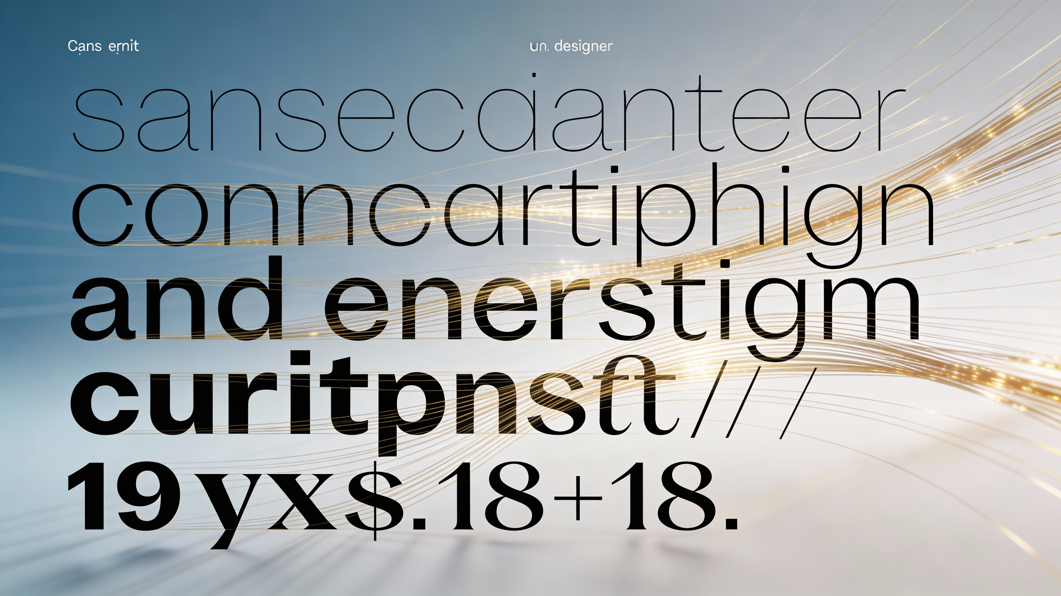
sans maker
Design custom sans-serif typefaces with AI-powered kerning, weight variations, and geometric precision. Generate complete font families with 9 weight options from thin to black, optimized for both digital screens and print applications.

Welcome to the future of typography! As a design tool, our AI-powered system can quickly generate bespoke sans-serif typefaces designed to meet your exact requirements. Our users typically find that starting with a specific geometric style, like neo-grotesque or humanist, helps them refine their design direction quickly. Experiment with the weight controls to dial in a font that truly sings – from a hairline delicate for headlines to a powerful black weight for strong emphasis. When you use the platform, you'll notice how seamlessly it handles kerning, making even complex letter combinations look balanced and professional.
This opens up creative possibilities across various projects. Imagine crafting a unique brand identity with a custom sans font maker at your fingertips, ensuring a modern and cohesive look across your website, marketing materials, and app interfaces. Or perhaps you're a game developer seeking a clean and readable UI font – our sans serif font generator can deliver exactly what you need, quickly. A practical tip: start by designing the regular weight first, then use that as a base to generate the other weights, creating a harmonious and usable font family with minimal effort.
How to use sans maker
Steps to get you started in BasedLabs.

Step 1
Define Your Sans-Serif Foundation
Set geometric parameters and style direction
Start by selecting your base geometric style: humanist (organic curves with calligraphic influence), grotesque (minimal stroke contrast with closed apertures), or geometric (pure circular and rectangular forms). Adjust the x-height ratio between 60-75% for optimal readability—higher ratios work better for UI text, while lower ratios suit editorial contexts. Set your cap height and ascender/descender proportions, keeping in mind that balanced ascenders (typically 120-130% of x-height) improve line spacing efficiency. Pro tip: Use the 'optical size' parameter to automatically adjust stroke contrast and spacing for intended use size (display vs. text).

Step 2
Configure Weight Range and Interpolation
Build your complete font family
Define your weight spectrum by setting minimum (thin/hairline at 20-40 stem width) and maximum (black/heavy at 180-220 stem width) values. The AI generates intermediate weights using multiple-master interpolation, ensuring smooth transitions and consistent stroke relationships. Enable 'optical weight compensation' to adjust perceived weight in curved vs. straight strokes—curves typically need 5-8% more mass to appear optically equal. Configure italic or oblique variants with slant angles between 8-15 degrees, and choose whether to apply true italic construction (with structural changes to 'a', 'f', 'g') or simple slanting.

Step 3
Refine Spacing and Export Production Files
Optimize metrics and generate font files
Fine-tune letter spacing using the AI's contextual spacing engine, which analyzes character pair frequencies and optical density. Set tighter tracking for display sizes (-20 to -40 units) and looser spacing for small text (+10 to +20 units). Review the automatically generated kerning pairs (typically 500-2000 pairs for comprehensive coverage) and adjust exceptions manually if needed. Before export, validate OpenType features including stylistic sets, fraction support, and tabular figures. Export your complete family with embedded naming tables, proper font metrics (ascender, descender, line gap), and hinting profiles optimized for Windows ClearType, macOS CoreText, and web rendering engines.
Complete Font Families in Minutes
Generate production-ready font families spanning thin to black weights with mathematically precise interpolation between masters. The AI ensures consistent stem weights, maintains optical balance across all weights, and automatically adjusts counter spaces to prevent visual clogging in heavier weights. Each family includes properly matched italic or oblique variants with weight-specific slant compensation, giving you 18+ font files that maintain perfect stylistic harmony across your entire typographic system.
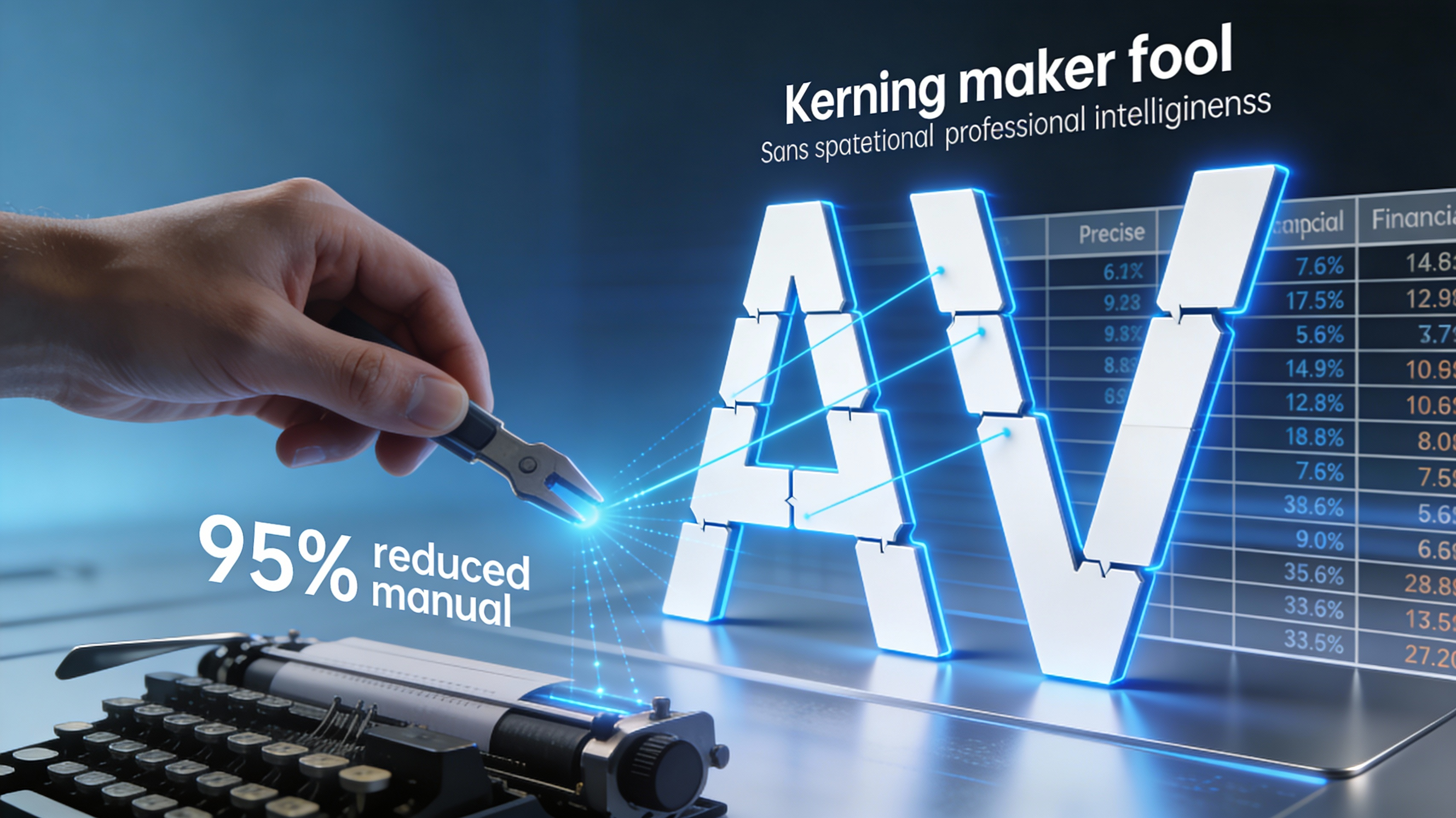
Professional-Grade Kerning Intelligence
Advanced optical kerning engine analyzes character shape interactions and generates pair-specific adjustments based on visual density rather than simple sidebearing math. The system handles complex scenarios like punctuation placement, diagonal stroke interactions (AV, WA), and numeral spacing for financial tables. Includes class-based kerning for efficiency and exception pairs for optical perfection, reducing manual kerning work by 95% while achieving professional typographer-level spacing quality.
Variable Font Technology Built-In
Export modern variable fonts that embed your entire weight range in one compact file, reducing web page load by 60-75% compared to loading individual weight files. Variable fonts enable dynamic weight adjustments via CSS, allowing responsive typography that adapts weight based on screen size, user preferences, or interactive states. The tool automatically generates proper variation axes, includes named instances for common weights, and optimizes the font's internal structure for minimal file size and maximum browser compatibility.

FAQs
Discover related AI tools:
- 0
Browse Related Content
Explore AI-generated sans maker artwork from our community
More From BasedLabs


Design Your Custom Sans-Serif Font Family
Join millions of creators using BasedLabs to generate professional, scroll-stopping content for social media, YouTube, marketing, and more — in seconds. Produce high-quality AI-generated videos and images optimized for engagement and reach. Streamline your content workflow and scale faster.